A Consteel
Somos uma empresa especializada na cedência de mão de obra para o setor da metalomecânica e trabalhamos no mundo inteiro.
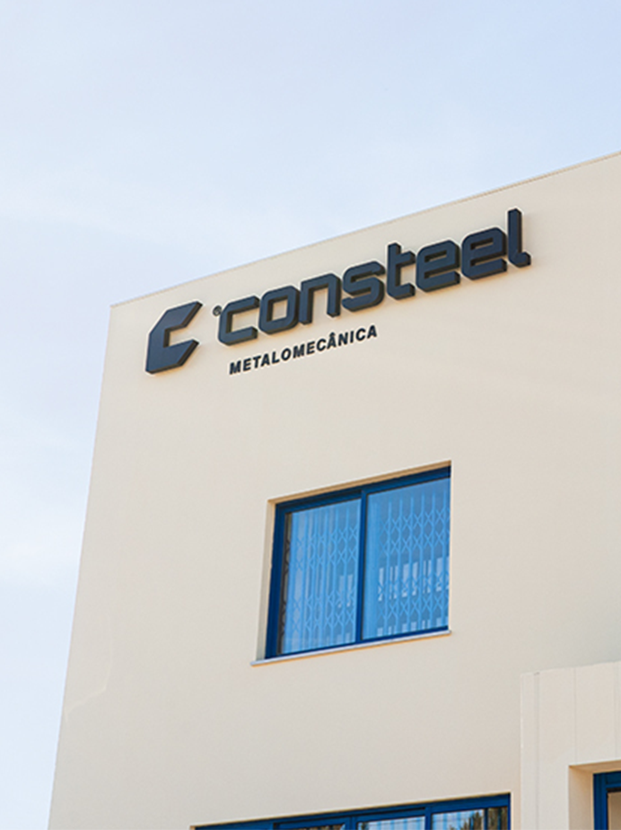
Nascemos em 2017 e temos sede em Cantanhede. As nossas equipas são dedicadas, experientes e preparadas para marcar a diferença. Assumimos o compromisso de garantir qualidade e confiança em todos os projetos em que participamos.
Trabalhamos com clientes que constroem sem limites e reconhecem na estrutura um elemento essencial do progresso. Valorizamos a precisão, a fiabilidade e os resultados que fazem avançar cada obra de forma segura e consistente.
O nosso propósito é desenvolver soluções ajustadas às necessidades específicas de cada cliente. Orientados para a excelência, atuamos sempre com responsabilidade e rigor, assegurando respostas eficientes.
Colocamos os interesses dos clientes e a segurança dos colaboradores em primeiro lugar. Num mercado cada vez mais global e competitivo, mantemos o foco em conquistar resultados que justificam a confiança depositada nos nossos serviços.
Serviços e Indústrias
Oferecemos soluções completas em metalomecânica, abrangendo diversos setores industriais com excelência técnica e inovação constante.
Celulose
Temos equipas especializadas e know-how técnico em manutenção e montagens industriais para o setor da celulose.
Petroquímica
Cedemos mão de obra qualificada para projetos de manutenção e montagens na indústria petroquímica.
Naval
Garantimos profissionais experientes na construção, reparação e manutenção de embarcações.
Hidroelétrica
Facultamos técnicos especializados em fabrico e montagem de válvulas e comportas para centrais hidroelétricas.
Cimenteira
Asseguramos equipas competentes para intervenções e montagens industriais no setor cimenteiro.
Siderurgia
Apresentamos soluções de mão de obra técnica para manutenção e montagem em ambientes siderúrgicos exigentes.
Metalomecânica
Colocamos ao serviço das indústrias, equipas com experiência em estruturas metálicas, pontes, depósitos e estádios de futebol.
Cerâmica
Reforçamos as operações industriais do setor cerâmico com equipas de manutenção e montagem altamente qualificadas.
Alimentar
Garantimos mão de obra especializada em soluções industriais seguras e eficientes para o setor alimentar.
Eólica
Disponibilizamos técnicos qualificados para o pré-fabrico e soldadura de componentes de torres eólicas.
Automóvel
Fornecemos especialistas em montagem mecânica e soldadura para a indústria automóvel.
Construção Civil
Contamos com profissionais experientes para projetos de construção de edifícios residenciais e montagem de caixilharias.
Projetos
Todos os dias, o futuro passa pelas mãos das nossas equipas. Com profissionalismo e competência, transformamos projetos, vencemos desafios e ajudamos a construir um mundo melhor.
Fundada
0
Número de trabalhadores
0
+
Horas de trabalho 2017 a 2025
0
Clientes
0
+